Exploring component style with AI
Exploring component style with AI

When I design a component, I find it easiest to arrive at a good solution when it is placed among many others. I don’t just create a single draft — I always work with multiple versions of the same design side by side to compare them. This was completely natural when making analog sketches in design school. They would always be laid out on the table so different solutions could be compared.
To ensure I have something to compare, I sometimes create two axes with different design choices. Then, I simply start filling out the grid.
In this example, I will go through the process of designing a button, focusing on padding and corner radius.
But instead of drawing them in Figma, as I normally would, I ask Claude to fill out my grid.
Claude example
My first prompt:
Hi. I am designing a button.
It should be blue with a white text .
Let the text be button. The text should be 16px and the line height should be 100%

I would like to explore the look.
So please create a grid of different versions.

On their vertical axes let us explorer corner radius of 0, 2, 4, 8, 12, 16

On the horizontal axis let us explorer the top&bottom paddings 4, 8, 12, 16. The side padding should be 1.5 bigger than the top/bottom padding.

This should give me 6x4=24 variants
This actually gave me what I wanted. But I then prompted a bit more to get be able to control the text size and hover effect.
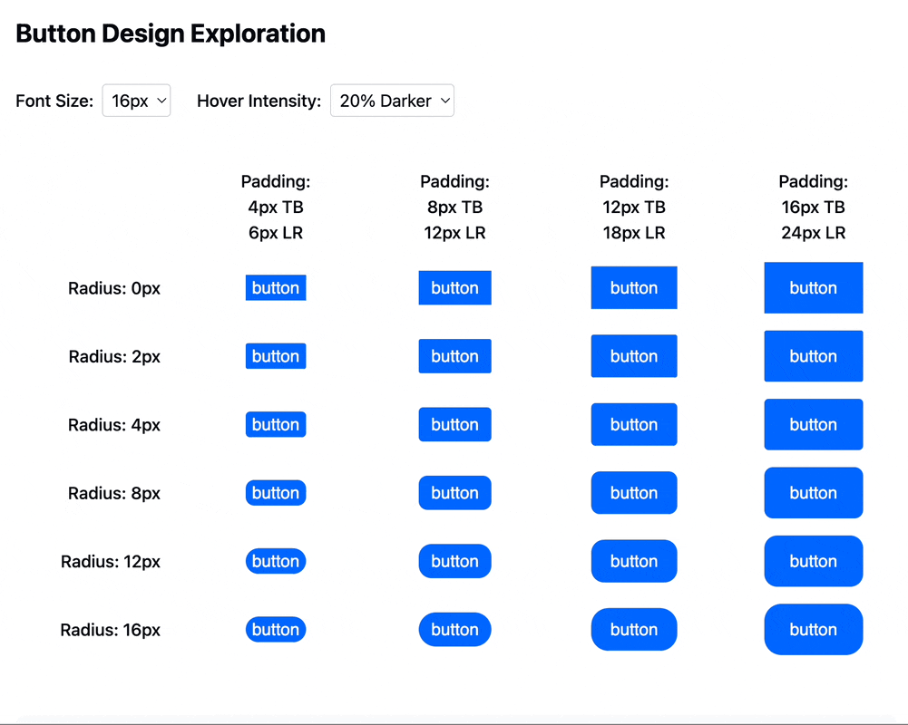
And there you can see the grid above that allows me to decide on the correct amount of text sixe, padding and corner radius for the style I am looking for. The test also allows to explore the hover style.
Have fun designing!