<input type=”exploration”>
See the original post with Interactive Forms examples.

Introduction
In this experiment, I’m exploring different ways to tweak the default text boxes, known as <input>. These text boxes are pretty common, especially in companies like the insurance one where I work. Whether you’re doing a online purchase or filing a claim, you’re likely to encounter these input fields. The purpose of this experiment is not to design the best input. Instead, I’m investigating how we can change how they look and exploring how different pairings between visual transform and interactions can show what’s going on with the input field and how the user is progressing in a form
Visual Transforms
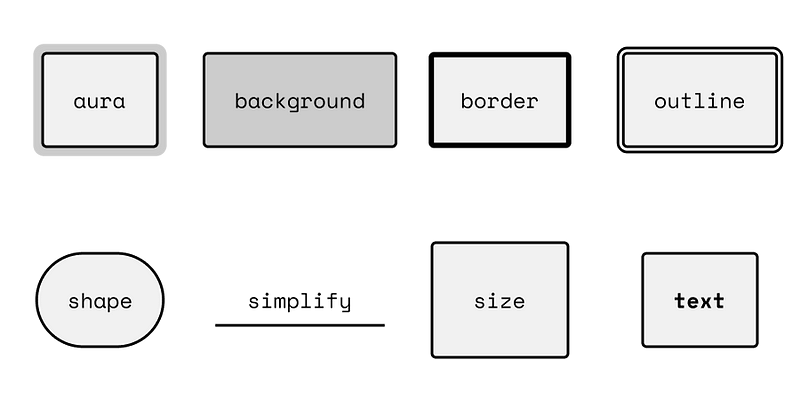
Above I have drawn eight potential examples on how the form field can be transformed. When thinking about how to transform the input it is beneficial to break into the different parts defining the field. If we start from the inside.
- Text: size, color, weight, or family.
- Padding: size
- Color: color
- Border: Color, width, style
- Corners: radius
- Outline: color, size, gap
Experiments
Below I have sketches different forms where I have paired the states with different visual transforms.

Active → Border: Width & Color
Hover → Border: Width
Filled → Background Color

Active → Outline
Hover → Aura
Filled → Border Color

Active → Border: Width, Style & Color
Hover → Border: Width & Background Color
Filled → Border: Style & Color

Active → Size
Hover → Size & Background Color
Filled → Size

Active → Shape & Border: Width & Color
Hover → Shape & Border: Width
Filled → Shape & Background Color

Active → Border: Width(s) & Color
Hover → Border: Width(s) & Color + Background Color
Filled → Border: Width(s) & Color